UCOOK
Improving conversion by removing friction in the first user journey
UX/UI Designer
Silvertree (UCOOK)
2025
Mixed methods
3.7%
old completion rate
9.3%
new completion rate
~R1.3M
annual revenue at risk
UCOOK's sign-up flow was identified as a key drop-off point in the customer journey, directly impacting conversion and revenue. The goal was to reduce friction, improve clarity, and increase successful account creation on desktop.
60+
Incomplete sign-ups per week
1.43%
Retention through the sign-up path
This was not on the roadmap. I initiated the investigation.
The Problem
Users were abandoning the sign-up process before completing account creation. Through initial data and internal feedback, we identified that:
The flow felt long and unclear
Users lacked confidence in what happens next
Key decisions (plan, meals, delivery) were introduced too early and without context
This created hesitation at the exact moment we needed commitment.
User pain
- Users confused sign-up with account creation.
- Could not find meals or navigate back.
- Subscription vs on-demand was unclear.
Business pain
- 60+ incomplete sign-ups per week.
- ~R1.3M/year revenue leaking through funnel.
- 56% of first billings 1–5 days post sign-up.
My Role
Product Designer
Led UX research and synthesis
Conducted usability testing (moderated & unmoderated)
Delivered interaction and UI redesign
Defined scroll and interaction behaviour for dev handoff
Goals
Validate whether sign-up was a genuine usability and conversion issue worth prioritising
Identify where and why users were dropping out of the journey
Define a clear, measurable happy path sign-up funnel
Reduce incomplete sign-ups and improve confidence around subscription activation and billing
Constraints
No baseline funnel existed for testing.
Billing logic was complex and misaligned with user mental models.
Earlier payment introduced operational refund risk.
Research & Insights
We used a combination of:
Customer service interviews
Tracked complaint categories. Flagged incomplete sign-ups.
Internal survey (n=16)
55% flagged unclear communication. Sign-up scored 6/10.
Competitive benchmarking
Marley Spoon, Taste Box, Hello Fresh. Clear step patterns.
Heuristic evaluation
Nielsen's 10. Three theme clusters identified.
Unmoderated testing (Maze)
Blocked. No defined happy path to test against.
Moderated usability testing
Three sessions. Navigation and pricing clarity issues surfaced.
Heatmaps & session recordings
Validated drop-off points and interaction patterns.
Key Insights
Users didn't understand the journey upfront
"What am I signing up for?" was unclear early on
Too many decisions too soon
Cognitive overload before users felt invested
Weak sense of progress
Users couldn't tell how far they were or what remained
Trust gaps at critical moments
Pricing, commitment, and flexibility weren't communicated clearly
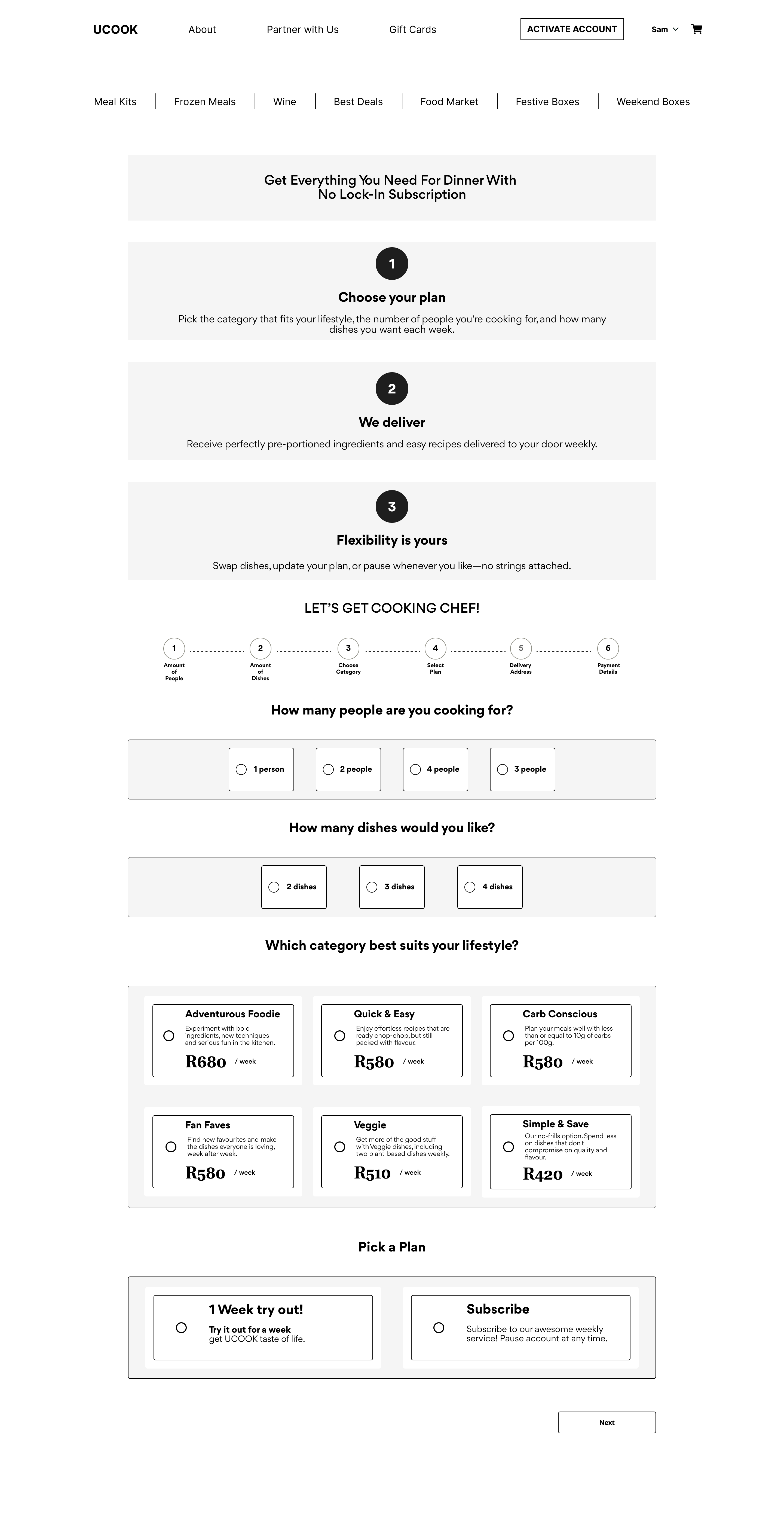
Design Approach
Guiding principle
Commitment should follow clarity, not precede it
Key changes
Restructured the flow
Moved low-friction steps first (email, basics)
Delayed complex decisions until users were more invested
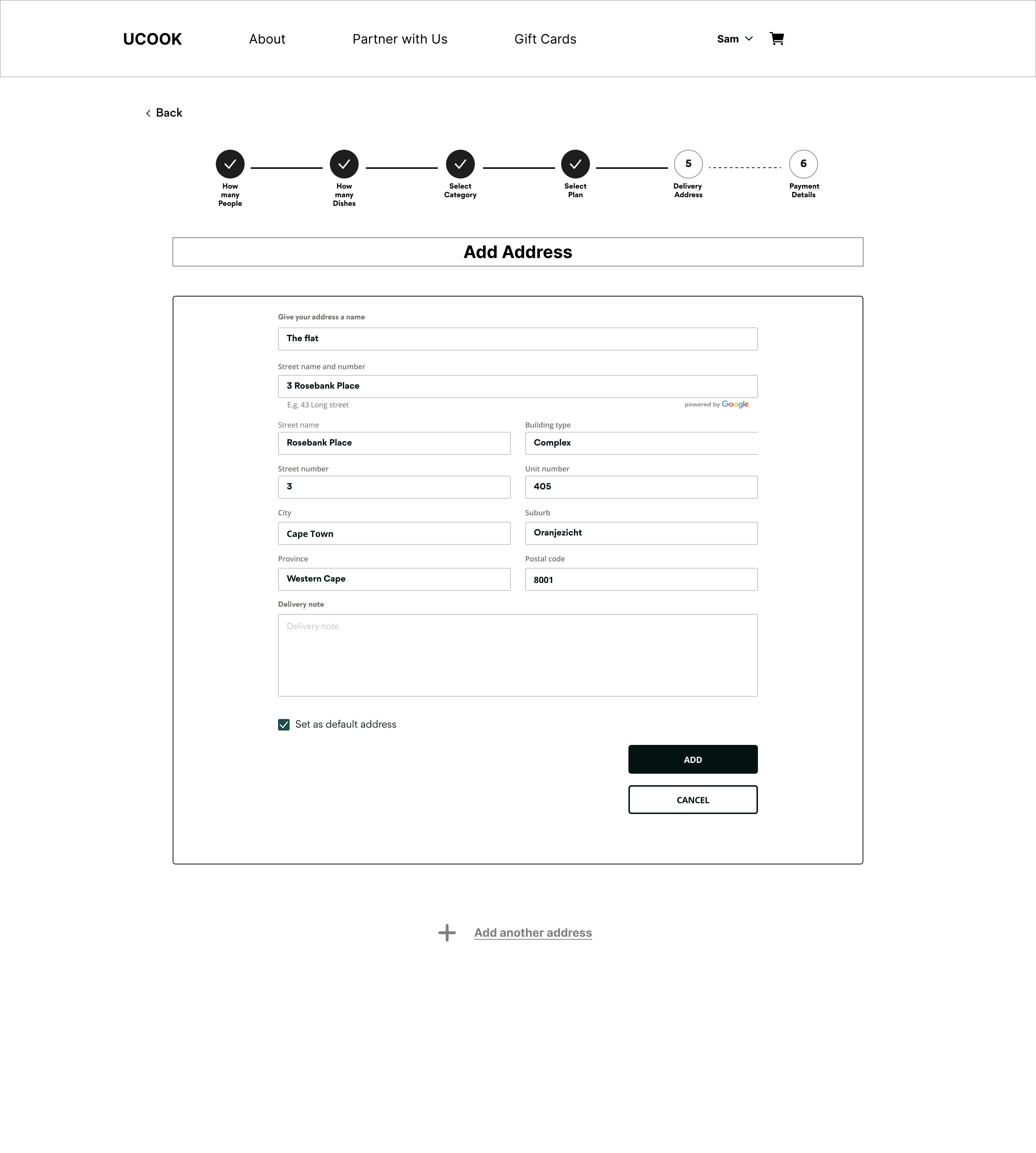
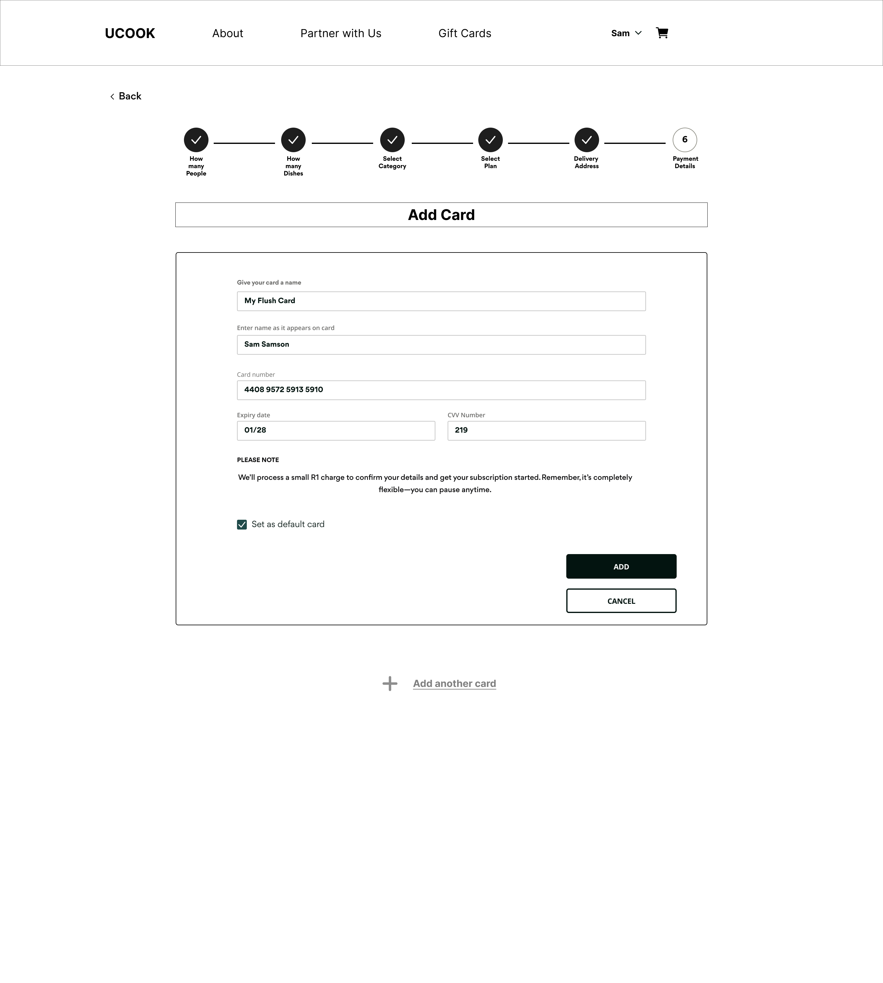
Introduced clear progression
Step-based flow with visible progress
Reduced perceived effort
Simplified decision points
Chunked choices into smaller, manageable steps
Added contextual guidance
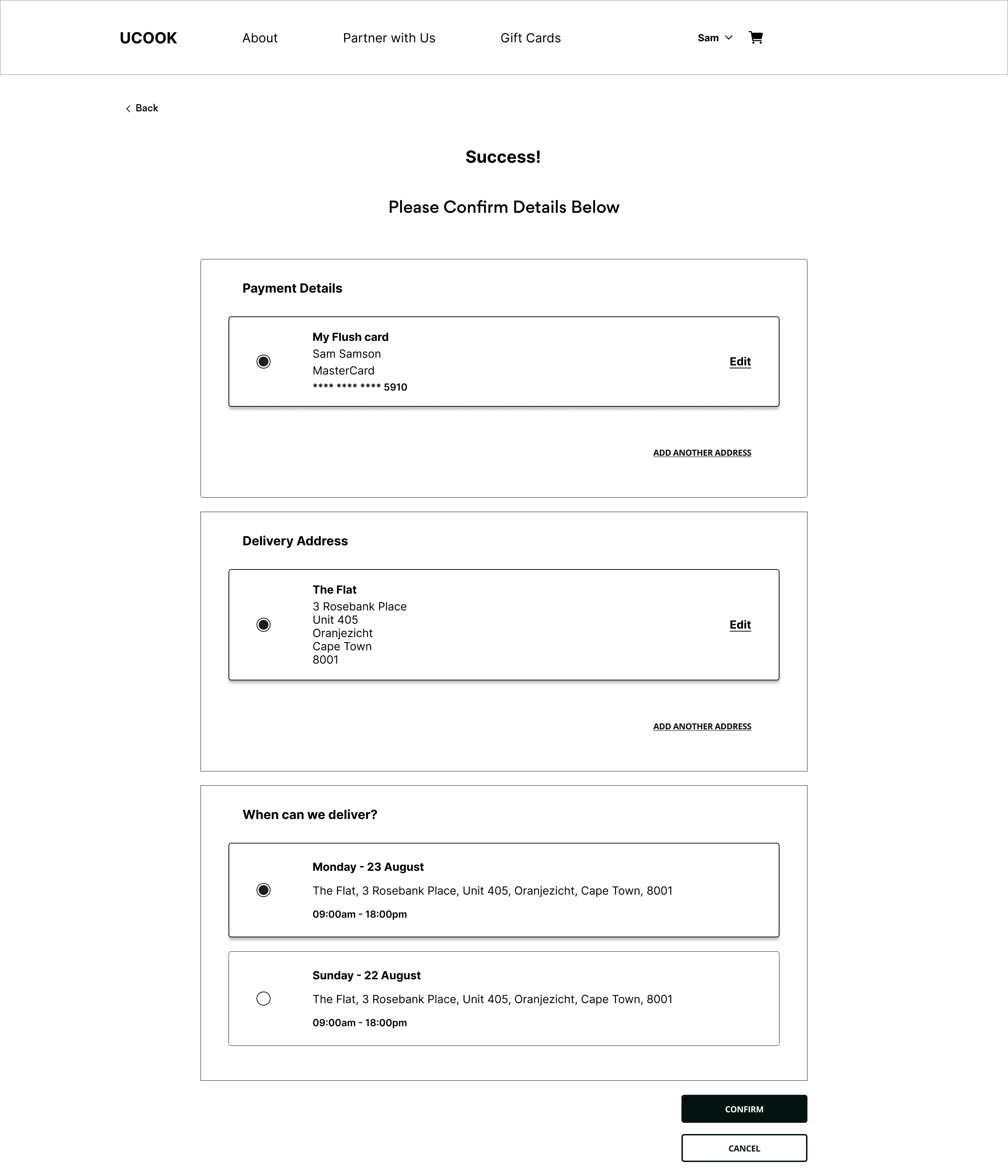
Improved trust and transparency
Clear pricing breakdown
Reinforced flexibility: skip or cancel anytime
Reduced anxiety at checkout
Defined scroll & interaction behaviour
Eliminated hidden content
Ensured key actions were always visible
Reduced missed CTAs
Option considered
Pay on Sign Up
Move payment to the start. Use the cart as the entry point. Auto-deduce customer profile from order.
01
Meal Kit Page
02
Add to Cart
03
Checkout
04
Address + Banking
05
Pay
06
Auto-profile
Risks identified
Subscription model not communicated before payment. Users commit without understanding recurring billing.
Pause and cancel functionality unclear at point of commitment.
Solves acquisition only. The retention problem remains unresolved.
Order changes post-payment introduce refund risk. Reduced orders take 2+ days to reflect, creating billing confusion at the point of highest user trust.
Solution
Two workstreams. Quick wins shipped independently. The structural redesign tackled the funnel itself.
Quick wins
Communication, navigation, UI clarity.
Structural redesign
Measurable funnel with payment decision.
Revised user journeys
Four paths. One outcome. No dead ends.
Wireframes
Handoff specifications
scrollIntoView()
Step transitions, error states.
Sticky header
Keeps users oriented during sign-up.
Form validation
Inline errors. Prevent incomplete submits.
Progress tracking
GTM triggers per funnel step.
Outcome
While final metrics are still being validated, early indicators showed:
Improved task completion in usability testing
Reduced hesitation at key decision points
Increased user confidence and clarity
Old funnel
3.7%
New funnel
9.3%
+5.6%
Absolute increase. Abandonment at the top of the funnel dropped from 91.1% to 75%. More users reached later stages.
~R255k
6-month redesign impact ROI · Aug 2025 – Jan 2026
R405k × 63% (3.7% → 9.3%) = ~R255k
Pending
- Payment timing decision outcomes.
- A/B testing results.
- Post-release refund and billing impact.
What I Learned
Users don't drop off because of one problem. It's cumulative friction.
Clarity early in a journey is more valuable than persuasion
Small interaction decisions (like scroll behaviour) have outsized impact